
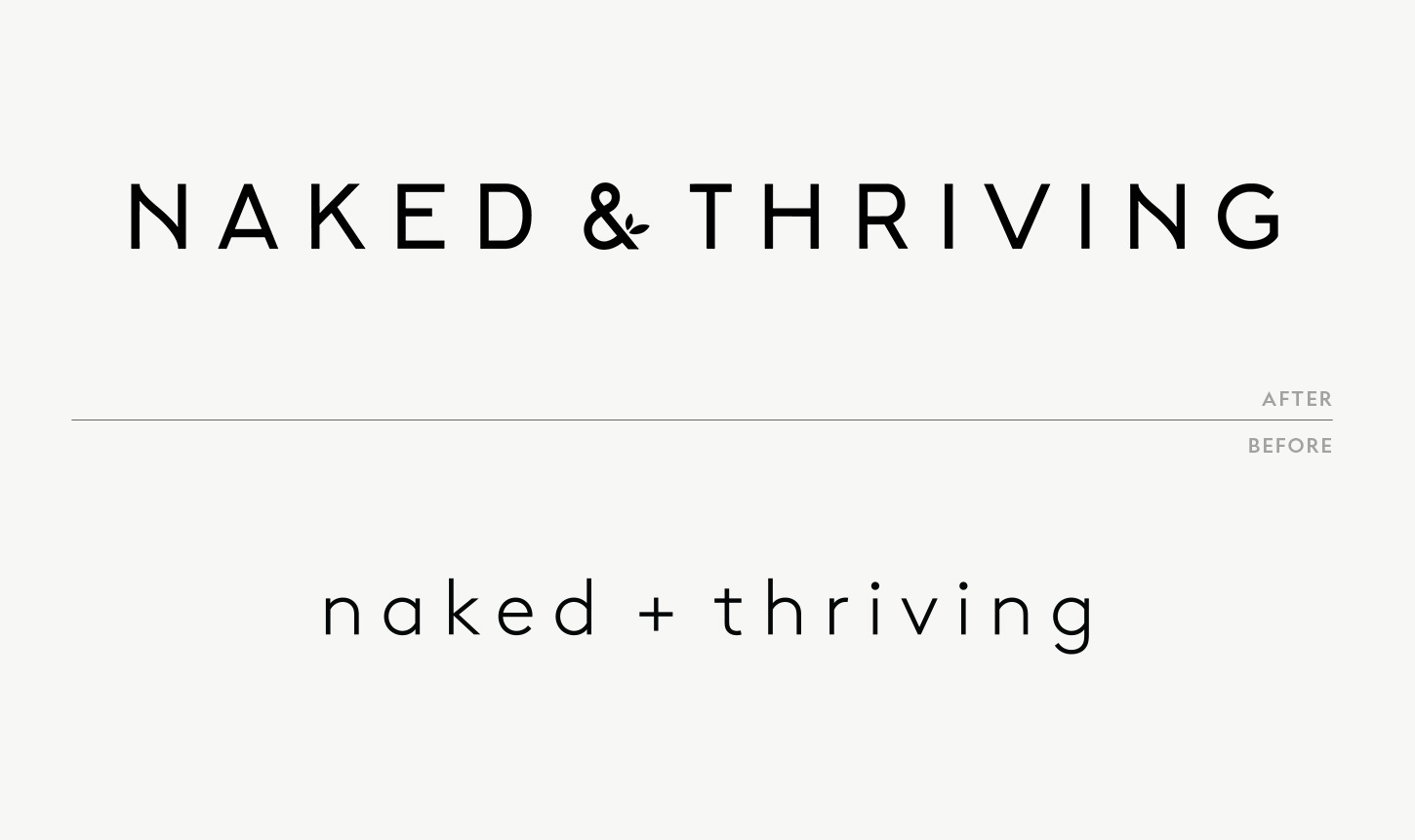
How It Looks
On packaging, money, and why "nice designs" are fighting words
Let’s start with the gossip. Last year, a few colleagues started tossing around phrases like “your designs are nice” or “good decoration.” At that, fire shot out of my ears. “Sure,” you might’ve heard me scoff. “The messaging and designs are probably just decoration. Nothing to do with the millions of dollars in revenue.”
That’s when I learned that sarcasm is not convincing. My dear husband–who has a PhD and a Samurai-like calm I will never possess–suggested a different approach: look at the numbers. So simple!
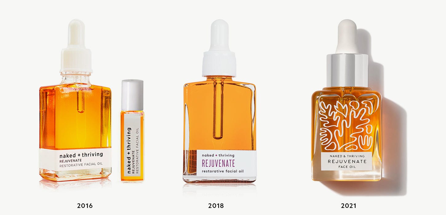
Here are the numbers. The first time I rebranded the company, revenue tripled. The second time, revenue tripled again. The following year, it doubled. Across customer feedback, everyone commented on the packaging.
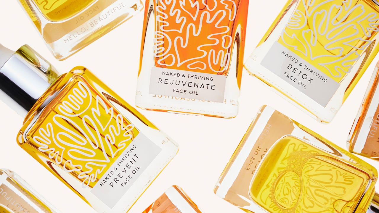
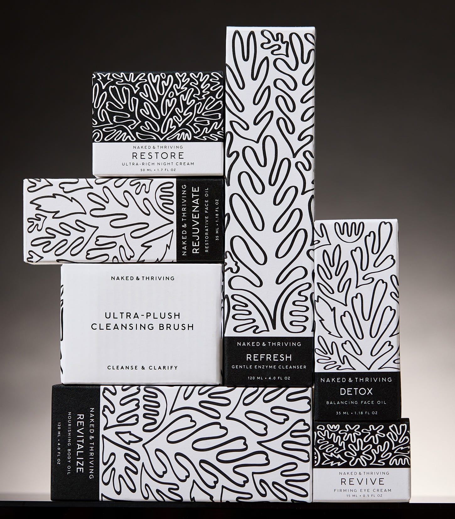
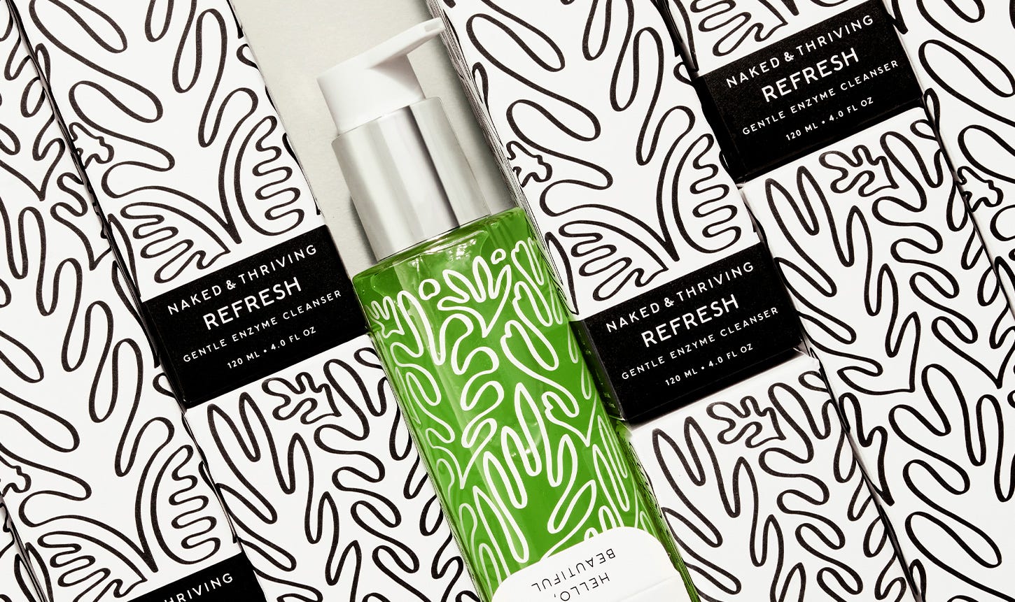
The question then, of course, is: did the rebrand account for the spike in revenue or something else? Brand is a broad topic involving just about every aspect of the company from messaging to operations, so I’ll focus on packaging. The new bottle and box designs were the centerpiece of our new brand expression, and the thing customers saw before converting.
First, let’s look at more numbers. In 2018, McKinsey conducted a study of 300 public companies over 5 years to analyze the impact of design on their bottom line. Their conclusion was that companies who invested in design grew 32% faster in terms of revenue than other companies. A 2018 Ipsos survey found that 72% of consumers say that packaging design plays an important role in their purchasing decisions, and logic tells us that packaging is one of the few brand assets that consumers encounter 100% of the time.
My brother’s brand came onto the scene during a boom in online advertising, namely on Meta. So the algorithm certainly did its thing. But in my view, the reason the rebrand was so successful was that we put the customer front and center in every decision. We had customer data, but it helped that I was also the target demographic: a middle-aged online shopper who wants things that both work and look great.
I also insisted on iterative processes, which sounds boring but…I mean…it’s not. Every year when we reordered packaging, my team and I reviewed the messaging and design, and wondered aloud: could it be better? The answer was always yes. We did the same for our branding and for our content strategy. What did we want to say and how? What was the best way to express our brand now, based on how we understood our position in the skincare landscape? Were we doing the best we could to educate customers about who we were and why we existed?
Marketing bros love to claim glory for things like deciding to send an email (duh). But you and I know that there’s a difference between the decision to send an email and determining exactly what the email will say and how it will look (tricky!). For a customer, the decision to buy comes down to the quiet moment when she thinks to herself, “My life will be so much better once I have this.” I should know. I’m basically Spanx’s top customer because when I see the models in the booty boost leggings, I am 100% certain my butt will look better as soon as I have them.1
But I digress. Artists don’t always do things for the money. When my brother asked me to rebrand his company (twice), I was all in simply because I was curious about the challenge and wanted to see what I was capable of. Plus, I wanted to make art people could hold in their hands (and…in their…bathrooms???).
Next time I embark on a glorious rebrand journey, I’ll measure obsessively. Designers have a superpower which is…design. We can present data beautifully and use it to showcase the vast impact branding has on a company’s bottom line, and to make a case for ourselves.
The branding I built from scratch for my brother has held for five years, and it still has room to grow. Nice designs, indeed.2
I literally don’t know why they haven’t reached out for me to be their brand ambassador.
Sorry not sorry. Spicy Margi is in the house.